
Collecting great testimonials is only half the job. The other half is deciding where to put testimonials on your website so they show up at the exact moment a visitor starts to doubt.
A glowing customer quote buried near the footer will not do much if the visitor makes their decision at the pricing table. A five-star rating on your homepage will not calm the nerves of someone hovering over the "Complete purchase" button. Placement is what turns proof into conversions.
In this guide, we will walk through the highest-impact places to add testimonials, page by page: the homepage, feature pages, pricing page, checkout, signup page, contact page, and comparison pages. For each one, you will see why proof matters there, which type of testimonial fits best, and a quick example you can copy.
The stakes are real. Nielsen's Trust in Advertising study found that 88% of global respondents trust recommendations from people they know above any other channel, and Northwestern University's Spiegel Research Center found that purchase likelihood for a product with five reviews was 270% greater than for a product with none. The question is not whether testimonials work. It is where to place them.
Why Testimonial Placement Affects Conversions
Every page on your website asks the visitor to do something: keep reading, click a feature, compare plans, enter a card number, or hit submit. At each of those moments, a small amount of doubt shows up. "Is this legit?" "Will it actually work for me?" "Am I about to waste my money?"
Testimonials work best when they answer that specific doubt right where it appears. This is the core idea behind building a high-conversion testimonial engine: match the proof to the objection, and place it next to the action.
A simple rule to keep in mind:
- Place the most relevant proof next to the claim or action it supports.
- Use proof that speaks to the doubt a visitor has on that page, not a generic quote.
- Never make the visitor scroll away from the decision to find reassurance.
If you want the psychology behind why this works, we cover it in Why Customer Testimonials Work. Below, we get practical about placement.
1. The Homepage
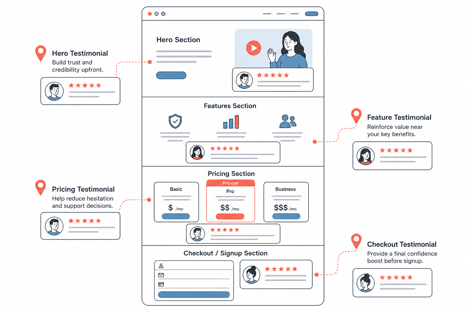
Your homepage is often the first impression, so it needs proof early. Most visitors arrive skeptical and scan before they read. A strong testimonial near the top tells them, within seconds, that real people trust you.
There are two prime spots on a homepage:
- The hero section. Place one short, punchy testimonial, a star rating, or a "trusted by" logo strip near your main CTA. This reassures visitors before they scroll.
- Mid-page, next to features. As you explain what your product does, add testimonial cards that back up each claim. If you say setup is fast, show a quote about fast setup.
For example, a hero testimonial might read:
"We added ProofWall to our homepage in an afternoon. Signups went up because visitors finally saw real customers, not just our own claims."
How to make it work: Keep homepage testimonials short and scannable, and include a name, photo, and role so they feel real. Save the long stories for deeper pages. For layout ideas, see 5 Creative Ways to Display Testimonials on Your Website.
2. Feature and Product Pages
Feature pages are where visitors evaluate whether your product actually solves their problem. This is the perfect place for proof that connects a specific feature to a specific result.
Generic praise is weak here. Instead, pair each major feature with a testimonial from a customer who used exactly that capability. If your feature page talks about video testimonials, show a customer quote about how video testimonials helped them close more deals.
"The embeddable widget was the feature that sold us. We dropped it into our product page and it just worked, no developer needed."
How to make it work: Position the testimonial immediately below or beside the feature description so the proof and the claim are read together. Reviews, ratings, and short outcome-focused quotes work well close to product details and calls to action. You can browse how embeds fit different stacks in the integration guides, or see the widget styles in action.
3. The Pricing Page
The pricing page is one of the highest-intent pages on your site, and also one of the most anxious. Visitors are weighing cost against value, and this is exactly where objections spike.
Testimonials on the pricing page should handle objections directly. Use quotes that speak to value for money, ease of getting started, or the outcome that justified the spend. Money-back guarantees, customer logos, and ratings reinforce the value of paid plans.
"I was worried about paying upfront, but ProofWall paid for itself within the first month once we started showing testimonials on our checkout page."
How to make it work: Place objection-handling testimonials near the plan a visitor is most likely to choose, and consider a "see what customers say" link to a fuller wall of proof. See how the plans are laid out on the pricing and product page.
4. The Checkout or Payment Flow
Checkout is where hesitation turns into abandonment. Baymard Institute's meta-analysis of 50 studies puts the average cart abandonment rate at 70.22%, and one of the top reasons buyers walk away is that they did not trust the site with their payment information.
Small, well-placed proof near the payment fields reduces that last-second doubt. Think short testimonials, star ratings, trust badges, and a clear guarantee, not long stories that pull attention away from completing the purchase.
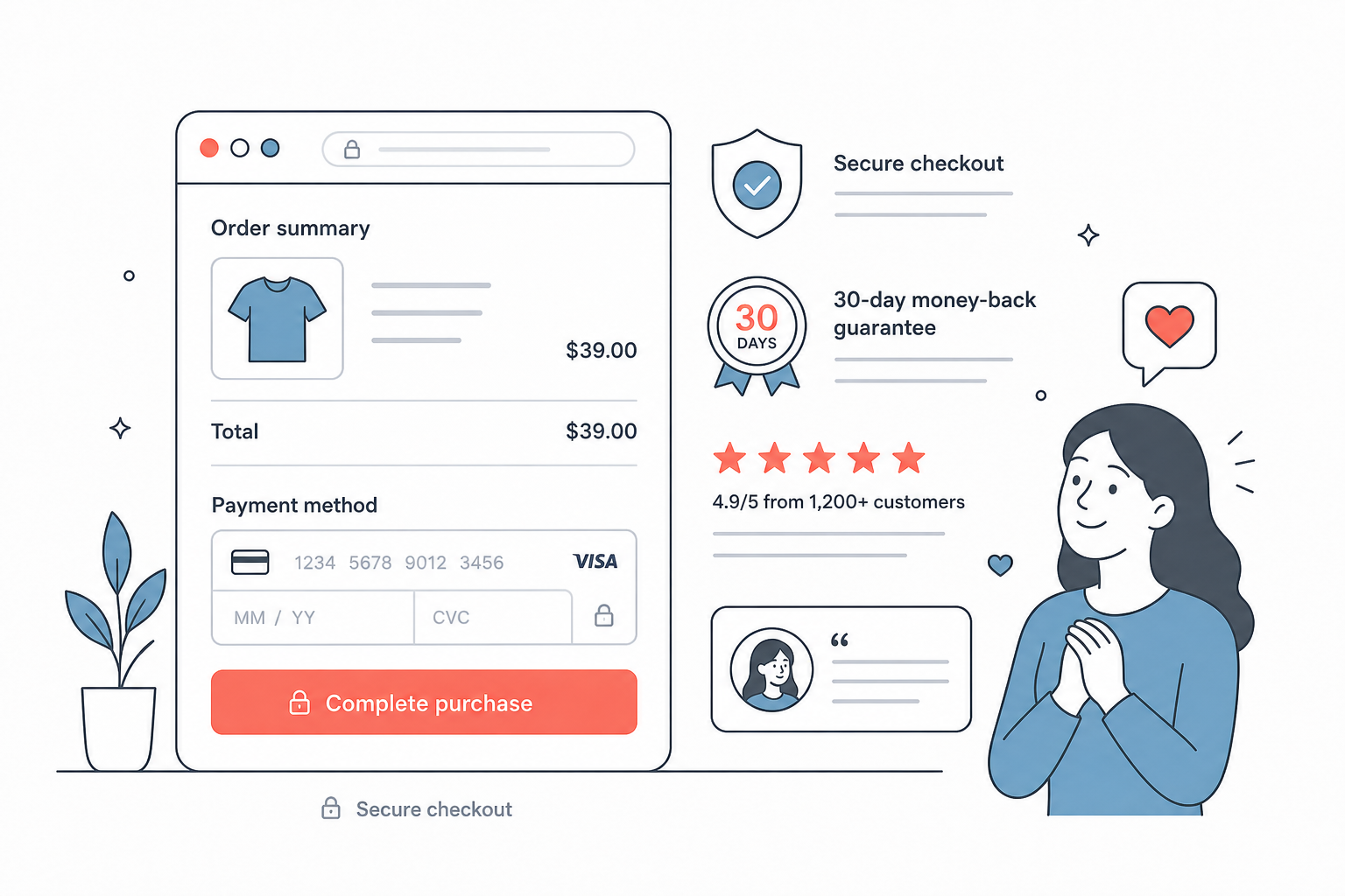
"Fast, secure, and exactly what was promised. Checkout took less than a minute."
How to make it work: Keep it minimal. A single reassuring quote, a security or money-back badge, and a rating are usually enough. Do not add a carousel that distracts from finishing the purchase. The goal is reassurance, not entertainment.
5. The Signup or Registration Page
The signup page is a commitment moment, even when it is free. Visitors are asking, "Is this worth my time and email?" Proof here lowers the friction of taking that first step.
This is a great place for adoption signals and quick wins: usage counters, a short testimonial about how easy it was to get started, or a rating that shows others took the leap and were glad they did.
"Signing up took two minutes and I had my first testimonial wall live the same day."
How to make it work: Put a short testimonial or a "join 2,400+ businesses" style counter right beside the signup form so it is visible while the visitor fills it in. Specific numbers feel more believable than vague claims. When you are ready, you can start collecting from your dashboard.
6. The Contact or Demo-Request Page
The contact or demo-request page is easy to overlook, but visitors who land here are high-intent, they are considering a real conversation. A little proof reassures them that reaching out is worth it and that your team delivers.
Testimonials here should reduce the fear of wasting time. Quotes about responsive support, a smooth onboarding, or a helpful sales conversation work well.
"The team answered every question before our demo. It was the easiest buying process we have had all year."
How to make it work: Add one or two testimonials that mention service, responsiveness, or onboarding right next to the form. This reassures visitors that submitting the form leads to a good experience, not a sales trap.
7. Comparison and Alternative Pages
Comparison pages, including "X vs Y" and "alternative to" pages, capture visitors in active evaluation mode. They are deciding between you and a competitor, so proof here is often the tiebreaker.
The most persuasive testimonials on these pages are switching stories: customers who moved from an alternative to you and explain why. That directly addresses the exact decision the visitor is trying to make.
"We switched to ProofWall after our old tool kept charging monthly for features we barely used. One payment, no subscription, same power."
How to make it work: Feature quotes that name the pain of the alternative (without trashing competitors) and highlight what improved after switching. See how we frame this on our own alternatives page. If you want examples of proof formats that build trust, our roundup of 15 social proof examples is a useful companion.
Testimonial Placement Cheat Sheet
If you only remember one thing, remember to match the proof to the moment. Here is a quick map of where to put testimonials and what type works best on each page:
- Homepage hero: one short testimonial, a rating, or a logo strip near the main CTA.
- Homepage mid-page: testimonial cards next to the features they support.
- Feature and product pages: outcome-focused quotes tied to specific features, plus ratings.
- Pricing page: objection-handling quotes, guarantees, and customer logos near the plans.
- Checkout: one short reassuring quote, a trust badge, and a rating, kept minimal.
- Signup page: a quick-win quote or a usage counter beside the form.
- Contact or demo page: quotes about support, onboarding, and responsiveness.
- Comparison and alternative pages: switching stories that explain why customers chose you.
Common Placement Mistakes to Avoid
Even good testimonials can underperform when they are placed poorly. Watch out for these:
- Hiding your strongest proof near the footer where few people scroll.
- Using the same generic quote on every page instead of matching proof to the page's job.
- Overloading the checkout with distracting carousels that pull focus from the purchase.
- Adding so many widgets that they compete with your CTA.
- Showing proof from the wrong audience for that page.
- Using vague quotes ("Great product!") that say nothing specific.
- Publishing testimonials without permission or using outdated logos and numbers.
The best placement feels natural. Each piece of proof should support the message on the page and make the next step feel safer, not interrupt the visitor.
How ProofWall Helps You Place Testimonials Everywhere
Most businesses already have more proof than they realize. It is scattered across emails, support chats, DMs, social posts, and sales calls. The hard part is collecting it and getting it onto the right pages.
ProofWall helps you collect text and video testimonials, approve the best ones, and embed them anywhere as walls, grids, carousels, or sliders, no code required. That means you can drop the right proof into your homepage hero, your feature pages, your pricing table, your checkout, your signup form, your contact page, and your comparison pages, all from one place.
If you need help gathering testimonials first, the templates in How to Ask for a Testimonial Over Email make it easy to start. Once you have a few strong quotes, you can see the widget styles in action, explore the integration guides, or start publishing from your dashboard.
Final Thoughts
Knowing where to put testimonials on your website comes down to a single principle: place the proof next to the decision. Your homepage sets the first impression, your feature and pricing pages handle evaluation, your checkout and signup pages reduce last-minute doubt, and your contact and comparison pages tip high-intent visitors over the edge.
Start small. Add one strong testimonial to your homepage hero, one objection-handling quote to your pricing page, and one reassuring line to your checkout. Then expand from there. Over time, your website stops just describing what you sell and starts proving that people trust it.
Frequently Asked Questions
Where should I put testimonials on my website first?+
Start with the highest-intent, highest-doubt pages: your homepage hero, your pricing page, and your checkout or signup flow. These are the moments where a small piece of proof has the biggest effect on conversions.
How many testimonials should I put on each page?+
Keep it focused. On most pages, one to three relevant testimonials near the CTA are enough. Checkout should stay especially minimal, often a single quote plus a rating or badge, so proof reassures without distracting from the purchase.
Should testimonials on the checkout page be different from the homepage?+
Yes. Homepage testimonials set a broad first impression, while checkout testimonials should be short and focused on trust and security to counter last-minute hesitation. Match the message on each page to the doubt a visitor has there.
What kind of testimonial works best on a pricing page?+
Objection-handling testimonials work best on pricing pages. Use quotes that speak to value for money, fast setup, or the result that justified the cost, ideally paired with a guarantee or customer logos.
Do testimonials help on comparison and alternative pages?+
Very much. Switching stories, where a customer explains why they moved from a competitor to you, directly address the decision a comparing visitor is trying to make, which makes them some of the most persuasive proof you can place.